"The most BEAUTIFUL design system, folks. Many are saying."
Brand Identity 💼
TRUMP.DESIGN is a tremendous, gorgeous, world-class visual language built on three pillars: GOLD, MORE GOLD, and EVEN MORE GOLD. Our system is the gold standard of design systems. Literally. It's gold.
Mission Statement
To make every pixel as opulent, gilded, and unnecessarily shiny as humanly possible. We believe restraint is for losers and that good taste is — frankly — overrated. Sad!
Brand Pillars
- 🏆 WINNING — every component must look like a trophy.
- 🪙 OPULENCE — if you can plate it in gold, you should.
- 🎺 VOLUME — bigger is better. Loudest font wins.
- 🏛️ FAUX-CLASSICAL — when in doubt, add a marble column.
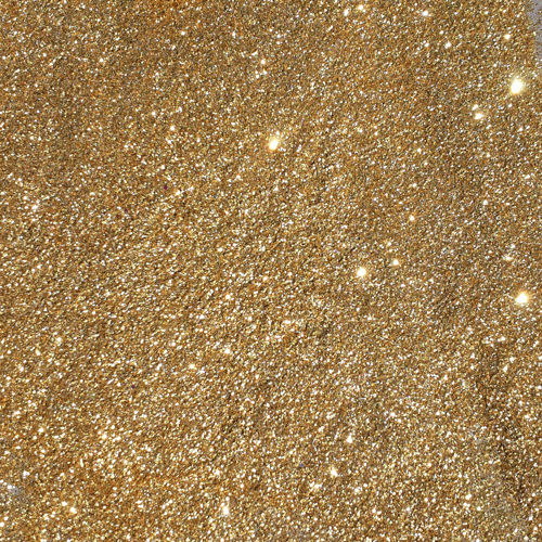
The Color Palette 🎨
Six approved colors. No others permitted. Use them all at once whenever possible. Contrast ratios are a deep state conspiracy.
Typography ✍️
Our type system is engineered to be read from across a ballroom. We use FIVE distinct typefaces — preferably on the same line.
Type Pairings
Always pair Comic Sans with Impact. Always set body copy in Papyrus. Underline things in wavy red — it adds gravitas.
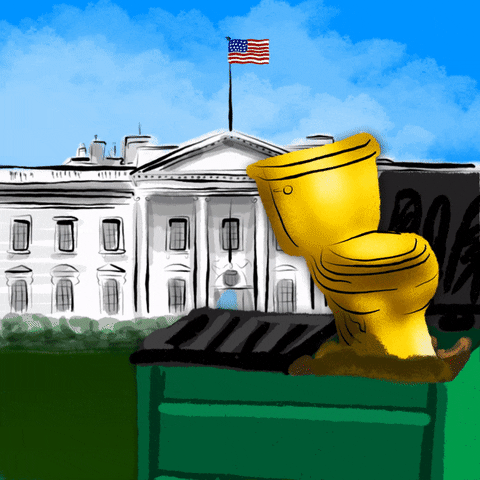
Iconography & Motion 🚽
Approved iconography. Each icon must be in motion at all times. Static is weak. Sad!


Spinning Emoji Library
💰 💵 💎 👑 🚽 🦅 🏛️ 💰
Components 🏆
Every button must scream. Every input must shimmer. Every card must outshine the next.
Primary Button
CLICK HERE NOWDestructive Button
FIRE THEMForm Input
Pull Quote Card
Voice & Tone 📣
Speak in superlatives. Always capitalize Important Nouns. Sentences should end in exclamation points. Or be questions? Either works.
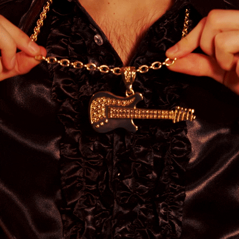
Imagery Guidelines 🖼️
Every image must contain at least one of: a marble column, a gold object, a chandelier, or a buffet table. Stock photography is encouraged. Lighting should be flattering — to the room, not the person.


"Don't Use" Elements 🚫
Under no circumstances may these elements appear anywhere in any layout, ever. Sad! Many people are saying. The WORST. Tremendous mistake. DO NOT use:


Use of these elements voids your tremendous warranty.
Do's & Don'ts ✅❌
DO ✅
- Use Comic Sans for legal disclaimers
- Add a 24K gold drop shadow to everything
- Mix five typefaces per paragraph
- Stack borders three deep
- Auto-play music if at all possible
DON'T ❌
- Use white space (it's wasted real estate)
- Set anything in lowercase. EVER
- Use a grid system. Grids are weak
- Apologize
- Read the WCAG guidelines
"Believe me — many people are saying it's the BEST styleguide."